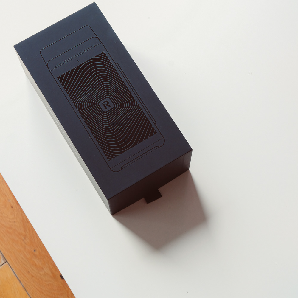

Revolut Terminal Packaging
Revolut recently announced a new Payment Terminal. This aims to help merchants to take payments in a variety of different situations, such as restaurants, cafes and in retail spaces.
The Industrial Design team was tasked to create a YouTube worthy Packaging experience, to help drive interest, but to also show merchants that their new Revolut Terminal was a worthwhile investment.
My involvement included designing the structural packaging, from concept to production.

Creating a Controlled Packaging Experience
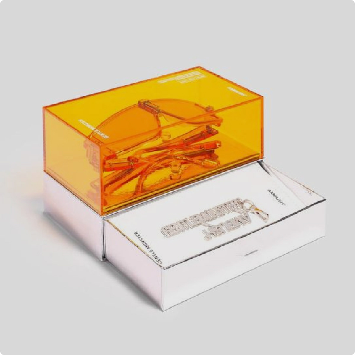
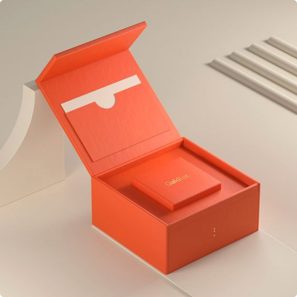
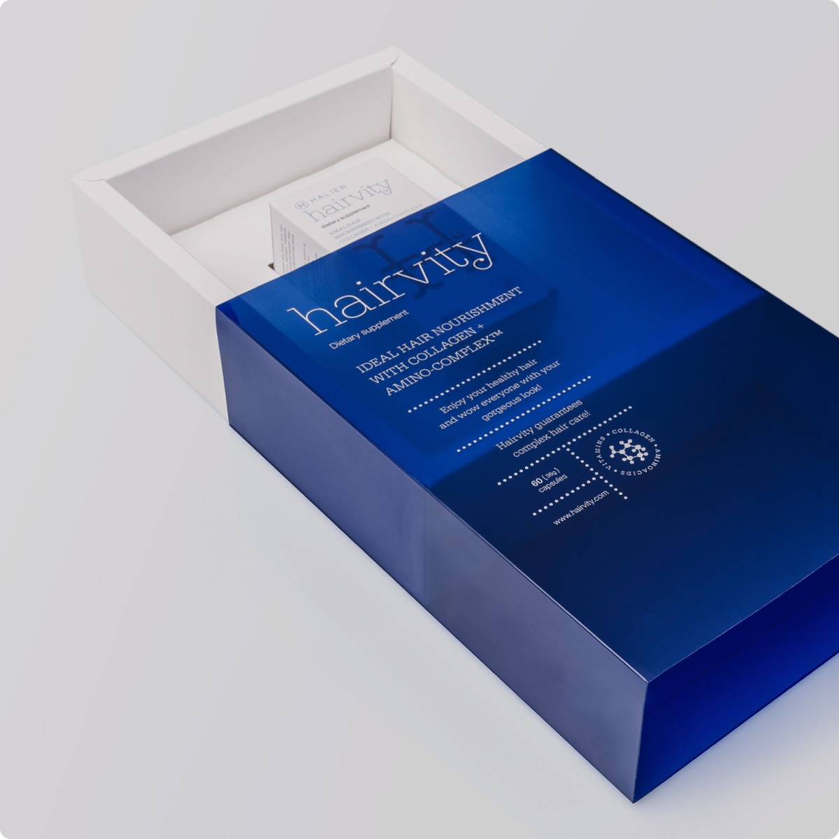
After initial sketches and development, we aligned on a narrow, but deep box, with a lift off lid. This created a more space efficient design, where components are stacked on top of each other, allowing for a higher number of units to be shipped.
The Stacked design also allowed us to control the packaging experience. We could take users on a journey and introduce components/ acesssories in a controlled manner, not to overstimulate and confuse users.
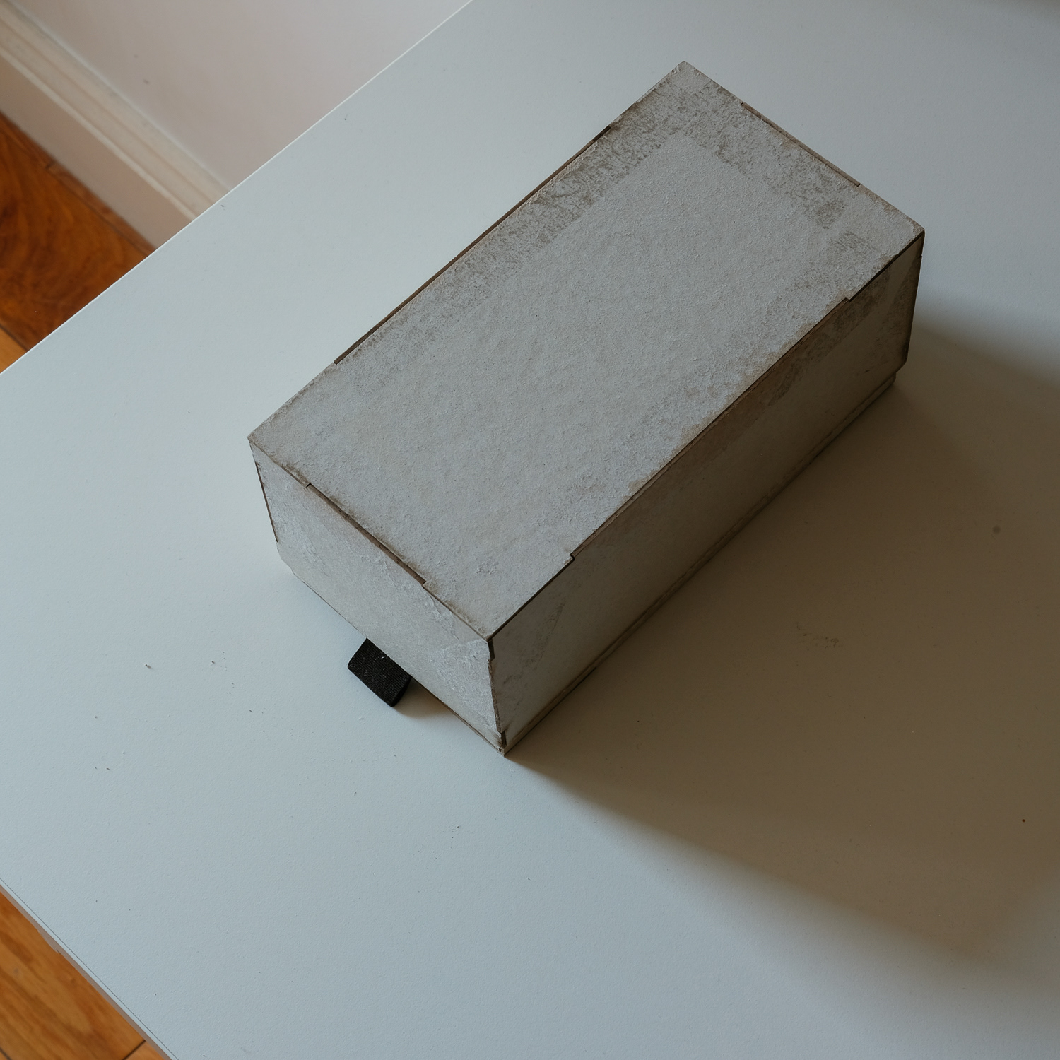
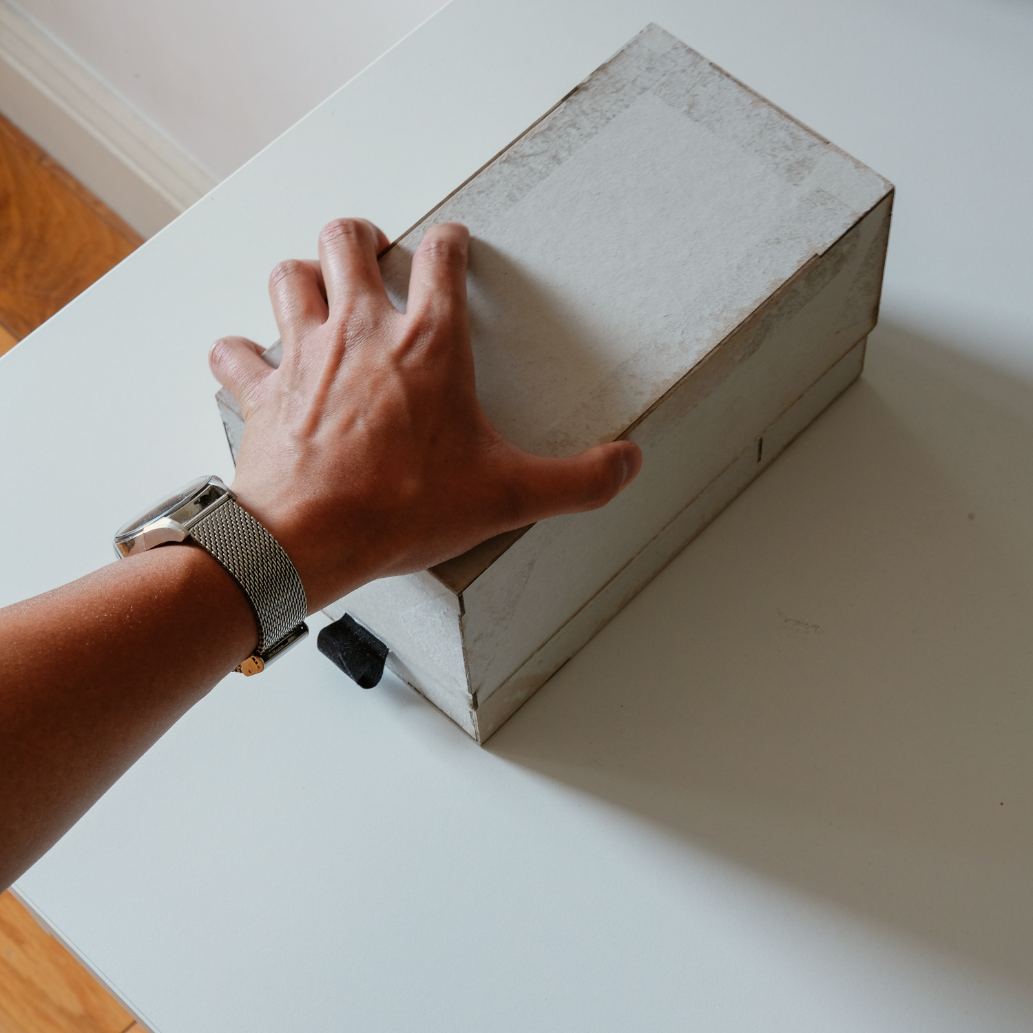
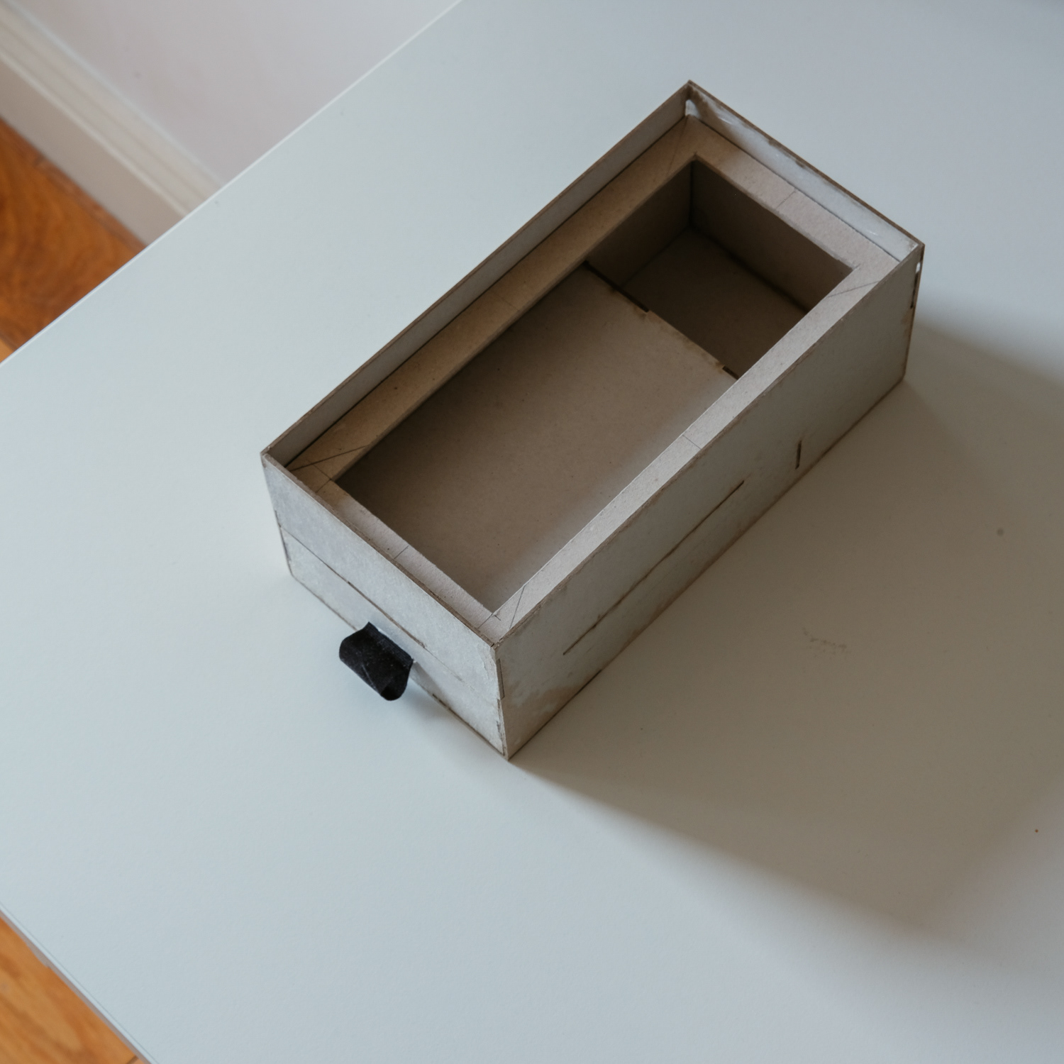
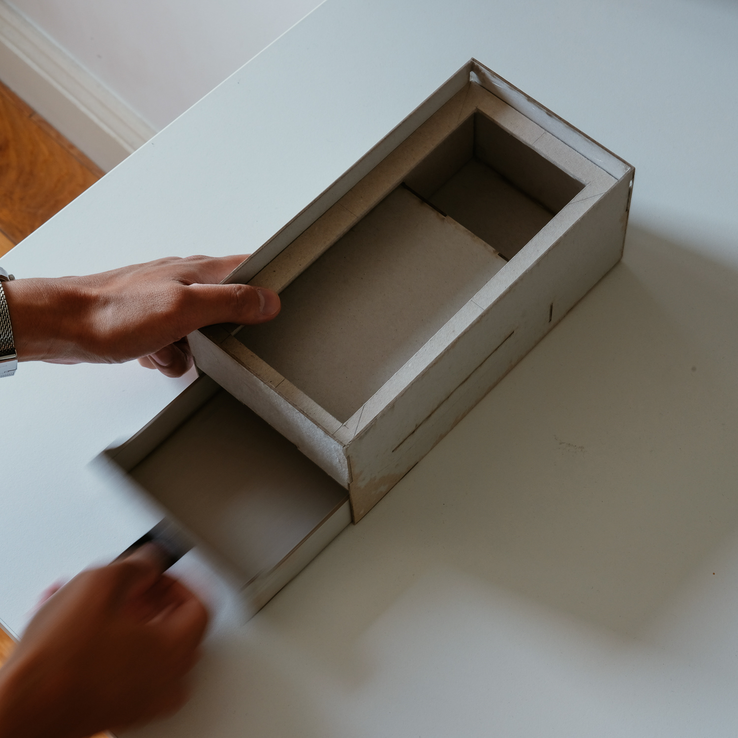
Early development to-scale prototypes of the Lift off Lid box, using 1.5mm greyboard. This was used in particular to develop the intergrated drawer for the Termnal Accessories
Unbox Therapy
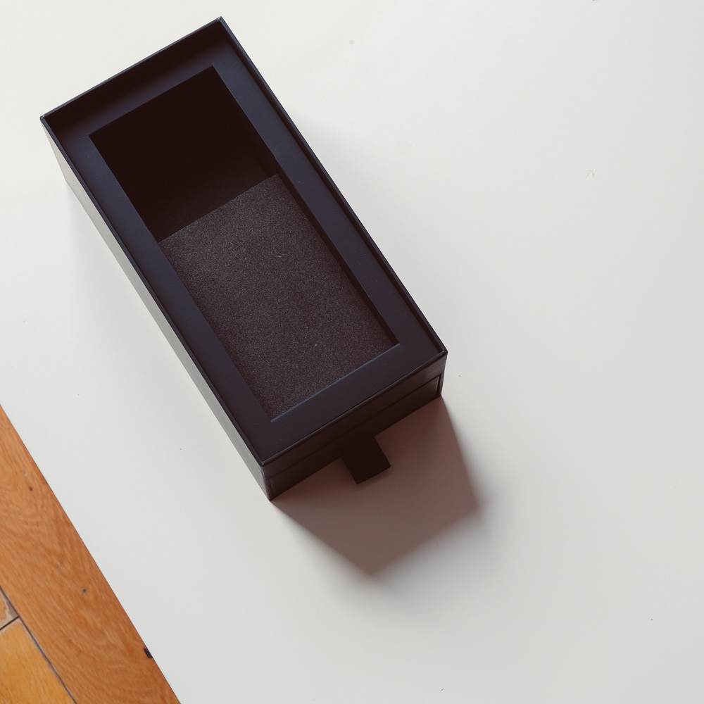
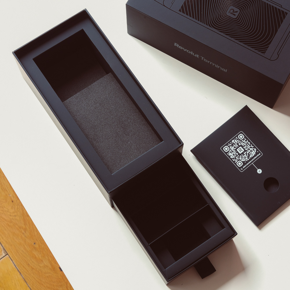
As the user lifts off the lid, they are presented soley with the terminal. The terminal sits proud from the insert to allow for easier extraction, as well as reducing the need for extraction tabs/holes.
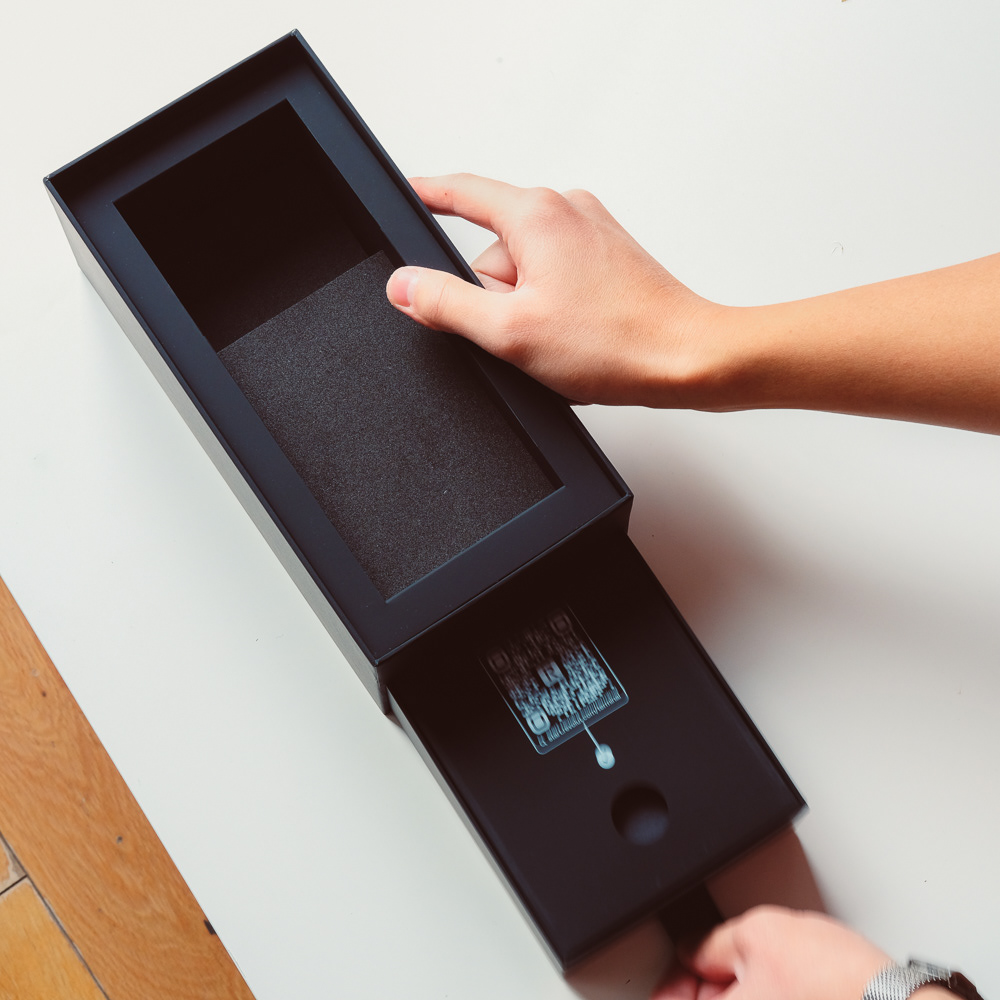
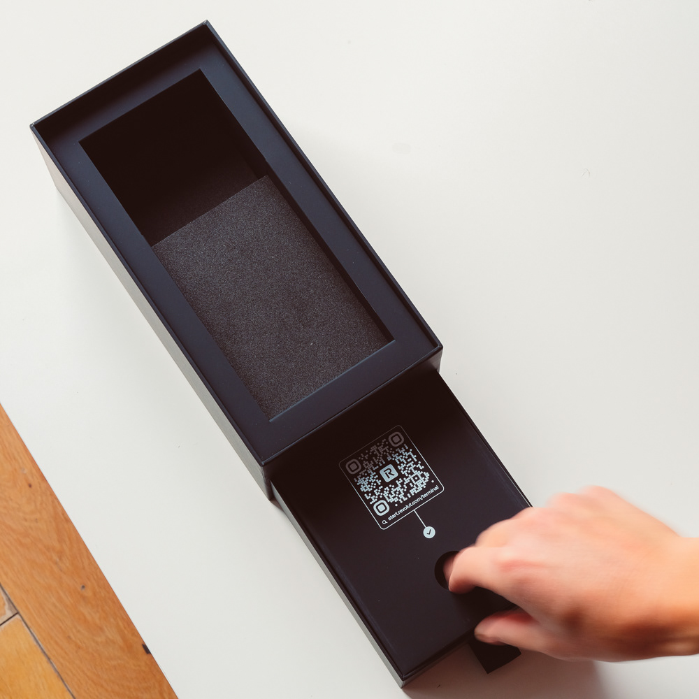
Users will then find a pull tab immediately in front of them, which opens a drawer that contains a set of stickers, the charging cable, brick and an additional roll of reciept paper.
Each product has its own carefully designed divider, which allows for safer delivery, but to also present these additional items in the best way possible.

Colour, Materials, Finishes
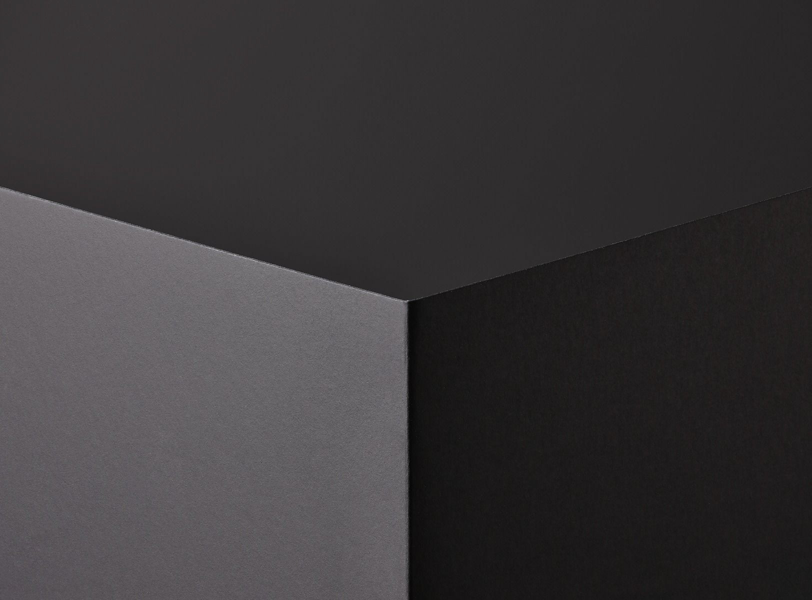
The Terminal Packaging is available to users in both White and Black - to reflect the Black and White Terminal devices available. We used GF Smith Plike as reference, this soft touch paper would take a wide variety of print options and would help further enhance the premium qualities of the device.
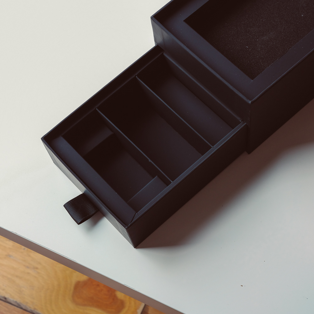
The drawer was used to separate the Terminal from the accessories. The additional paper roll, Charging cable and Brick all have specially designed dividers to provide a structured opning experience, but to also provide security when in transit.
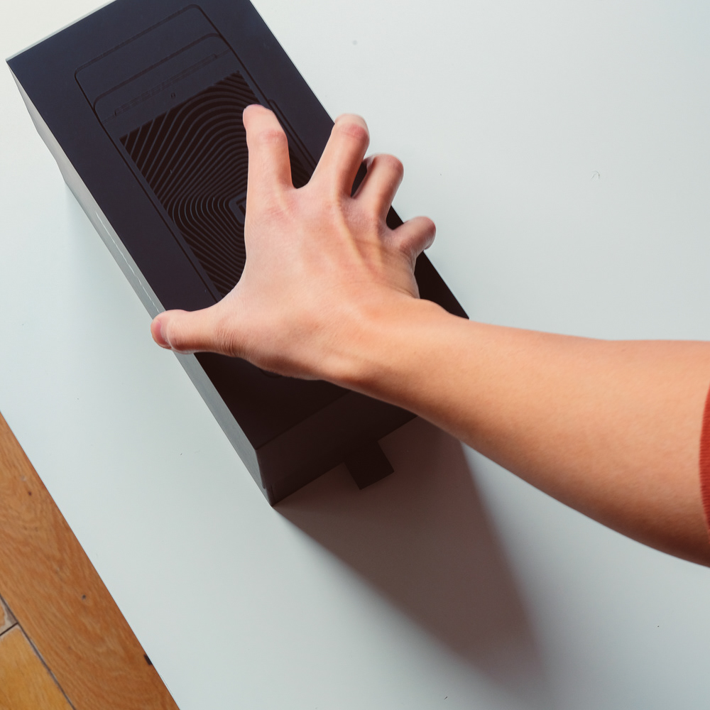
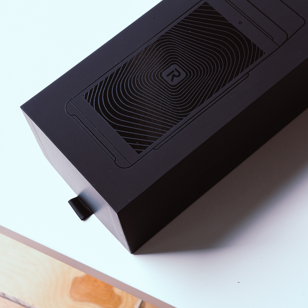
Both boxes feature a to-scale illustration of the terminal. The black box features a Black Foil blocked illustration while the White box features a silver foiled illustration. Both were used to bring extra tactility to the opening experience.